emandrael
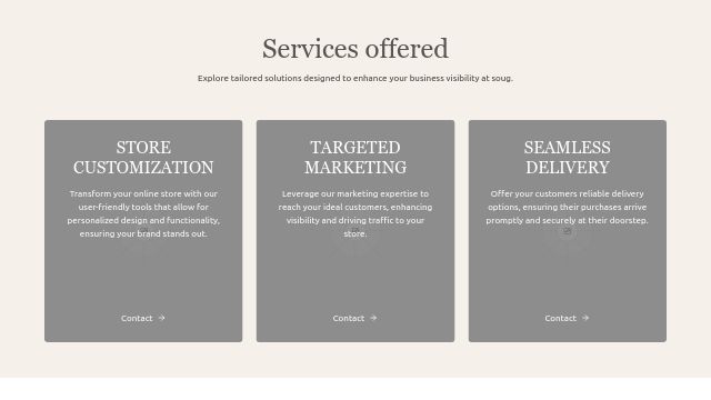
Convert from TSX to Vue import Image from "next/image" import Link from "next/link" import { ArrowRight } from "lucide-react" export default function ServicesSection() { return ( <section className="w-full py-16 bg-[#f5f1ea]"> <div className="container mx-auto px-4 max-w-6xl"> <h2 className="text-4xl md:text-5xl font-serif text-center text-stone-600 mb-4">Services offered</h2> <p className="text-center text-stone-700 mb-16 max-w-3xl mx-auto"> Explore tailored solutions designed to enhance your business visibility at soug. </p> <div className="grid md:grid-cols-3 gap-6"> {/* Store Customization */} <div className="relative overflow-hidden rounded-sm group"> <div className="absolute inset-0 bg-black/40 z-10"></div> <Image src="/placeholder.svg?height=600&width=400" alt="Store customization" width={400} height={600} className="w-full h-[400px] object-cover" /> <div className="absolute inset-0 z-20 p-8 flex flex-col justify-between text-white"> <div> <h3 className="text-2xl md:text-3xl font-serif mb-2 text-center"> STORE <br /> CUSTOMIZATION </h3> <p className="mt-4 text-center"> Transform your online store with our user-friendly tools that allow for personalized design and functionality, ensuring your brand stands out. </p> </div> <div className="text-center"> <Link href="#" className="inline-flex items-center text-white hover:underline"> Contact <ArrowRight className="ml-2 h-4 w-4" /> </Link> </div> </div> </div> {/* Targeted Marketing */} <div className="relative overflow-hidden rounded-sm group"> <div className="absolute inset-0 bg-black/40 z-10"></div> <Image src="/placeholder.svg?height=600&width=400" alt="Targeted marketing" width={400} height={600} className="w-full h-[400px] object-cover" /> <div className="absolute inset-0 z-20 p-8 flex flex-col justify-between text-white"> <div> <h3 className="text-2xl md:text-3xl font-serif mb-2 text-center"> TARGETED <br /> MARKETING </h3> <p className="mt-4 text-center"> Leverage our marketing expertise to reach your ideal customers, enhancing visibility and driving traffic to your store. </p> </div> <div className="text-center"> <Link href="#" className="inline-flex items-center text-white hover:underline"> Contact <ArrowRight className="ml-2 h-4 w-4" /> </Link> </div> </div> </div> {/* Seamless Delivery */} <div className="relative overflow-hidden rounded-sm group"> <div className="absolute inset-0 bg-black/40 z-10"></div> <Image src="/placeholder.svg?height=600&width=400" alt="Seamless delivery" width={400} height={600} className="w-full h-[400px] object-cover" /> <div className="absolute inset-0 z-20 p-8 flex flex-col justify-between text-white"> <div> <h3 className="text-2xl md:text-3xl font-serif mb-2 text-center">SEAMLESS DELIVERY</h3> <p className="mt-4 text-center"> Offer your customers reliable delivery options, ensuring their purchases arrive promptly and securely at their doorstep. </p> </div> <div className="text-center"> <Link href="#" className="inline-flex items-center text-white hover:underline"> Contact <ArrowRight className="ml-2 h-4 w-4" /> </Link> </div> </div> </div> </div> </div> </section> ) }
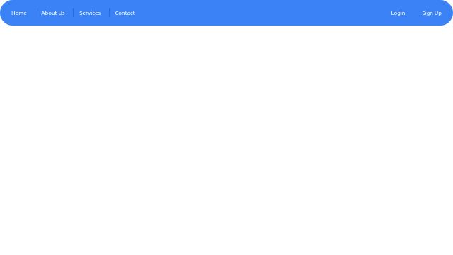
Creeate a navbar blue, circular corners with dividers for every section.