apt-team-018
**Project: Redesign Google Homepage** --- ### Design Brief for Development Team #### Theme and Color Palette Our redesign of the Google homepage will feature a modern, clean, and user-friendly interface with a vibrant color theme. The primary color will be a bold red (#FF0000), which will be used for interactive elements such as buttons, links, and the Google logo. The secondary color is a light gray (#F2F2F2), which will be utilized for backgrounds and subtle accents to ensure visual hierarchy and readability. The background of the page will be a crisp white (#FFFFFF), creating a fresh and inviting base for our design. #### Typography and Layout For our typography, we will be using Google's own font, 'Product Sans', which is clean, modern, and perfectly in line with the Google brand. This font should be used for all text elements across the page. The layout will be centered, with a maximum width of 1200px to ensure readability and accommodate various screen sizes. The Google logo will be prominently displayed at the top center of the page, with an animated loading effect that transitions into the static logo upon full page load. #### Components and Positioning The homepage will include a top navigation bar featuring 'Images', 'Maps', 'Gmail', 'Drive', and 'More' options, each in the primary red color. Below this, we will place the Google search bar, which will be the main focus of the page, positioned in the center and slightly above the middle of the page for easy access. The news boxes will be located below the search bar, featuring dynamic content pulled from Google News sources, with headlines in black text on a white background. Each news box should include an image, a headline, and a short description, with the headline in bold 'Product Sans' and the description in regular 'Product Sans'. The 'Google Search' and 'I'm Feeling Lucky' buttons will be placed below the search bar, using our primary red color. The footer will include links to 'Privacy', 'Terms', and 'Settings' at the bottom, using the light gray color. ### Additional Notes Ensure that the design is responsive and looks equally appealing on mobile devices. Accessibility is a key concern, so design with alt text for images and proper contrast ratios. The page should be coded using HTML5, CSS3, and leverage JavaScript for interactive elements like the animated logo and dynamic news content. We aim for a design that is not only visually stunning but also user-friendly and accessible to everyone. Please adhere to these guidelines as you begin the design and development phase. If you have any questions or need further clarification, do not hesitate to reach out. Let's create a homepage that stands out and truly represents the Google brand.
button, color should be black
Certainly! To create a visually stunning and engaging homepage for a site like Perplexity, the design should reflect the essence of the brand while providing a user-friendly interface. The homepage should encapsulate Perplexity's commitment to exploring complex ideas and questions, so a theme that combines elements of mystery, intelligence, and curiosity would be fitting. A gradient background, transitioning from a deep, thoughtful blue to a lighter, inspiring indigo, can set the tone, suggesting depth and the unknown while also conveying the thrill of discovery. For the typography, selecting a clean, sans-serif font like Helvetica or a similar modern typeface will ensure readability and a professional look. The main header, "Perplexity," should be displayed prominently at the top center of the page, using a bold variant of the chosen font, with a font size of at least 48pt to command attention. Subheadings and body text should be smaller, around 18pt and 12pt respectively, in a lighter weight to maintain hierarchy and balance. Text should be placed in well-defined sections, with ample white space for a clean and uncluttered appearance. The primary navigation menu should be positioned immediately below the header, with a horizontal layout, using uppercase letters and a hover effect to highlight the selected option. Color plays a crucial role in enhancing user engagement. Apart from the gradient background, the primary color should be a vibrant green, symbolizing growth and intelligence, which can be used for call-to-action buttons and links. Secondary text and borders can be a darker shade of the primary color for contrast. Images and graphics should be high-quality and relevant, with a focus on visual representations of complex concepts to intrigue and engage visitors. For instance, incorporating dynamic, interactive elements such as animated infographics or a captivating video header can make the homepage truly stand out and invite users to explore further. By following these design principles, the Perplexity homepage will not only be visually appealing but also functional and inviting, reflecting the brand's values and mission.
Certainly! To create a visually stunning and engaging homepage for a site like Perplexity, the design should reflect the essence of the brand while providing a user-friendly interface. The homepage should encapsulate Perplexity's commitment to exploring complex ideas and questions, so a theme that combines elements of mystery, intelligence, and curiosity would be fitting. A gradient background, transitioning from a deep, thoughtful blue to a lighter, inspiring indigo, can set the tone, suggesting depth and the unknown while also conveying the thrill of discovery. For the typography, selecting a clean, sans-serif font like Helvetica or a similar modern typeface will ensure readability and a professional look. The main header, "Perplexity," should be displayed prominently at the top center of the page, using a bold variant of the chosen font, with a font size of at least 48pt to command attention. Subheadings and body text should be smaller, around 18pt and 12pt respectively, in a lighter weight to maintain hierarchy and balance. Text should be placed in well-defined sections, with ample white space for a clean and uncluttered appearance. The primary navigation menu should be positioned immediately below the header, with a horizontal layout, using uppercase letters and a hover effect to highlight the selected option. Color plays a crucial role in enhancing user engagement. Apart from the gradient background, the primary color should be a vibrant green, symbolizing growth and intelligence, which can be used for call-to-action buttons and links. Secondary text and borders can be a darker shade of the primary color for contrast. Images and graphics should be high-quality and relevant, with a focus on visual representations of complex concepts to intrigue and engage visitors. For instance, incorporating dynamic, interactive elements such as animated infographics or a captivating video header can make the homepage truly stand out and invite users to explore further. By following these design principles, the Perplexity homepage will not only be visually appealing but also functional and inviting, reflecting the brand's values and mission.
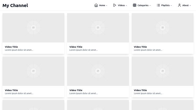
Creating a custom YouTube homepage involves envisioning a design that not only reflects your personal style or brand identity but also enhances user engagement and navigation. To start, consider the theme of your homepage, which should align with the content you produce. For instance, if your channel focuses on technology, a sleek, modern theme with clean lines and high-tech visuals would be appropriate. If you're a lifestyle vlogger, perhaps a more vibrant, colorful, and friendly theme would resonate better with your audience. Themes can set the tone for the visual aesthetic, guiding the choice of fonts, colors, and layout. For fonts and colors, choose combinations that are visually appealing and ensure readability. A sans-serif font like Arial or Roboto can give a contemporary feel and is easy to read on screens. Use bold or italic styles to emphasize titles or important text elements. As for colors, a primary color paired with one or two accent colors can create a harmonious look. If your channel has a logo, consider using the colors from it to maintain brand consistency. Place your channel name prominently at the top, possibly in a larger font size. Thumbnails of your latest videos should be clearly visible, perhaps arranged in a grid or a list, depending on the volume of content. Don't forget to include a section for video categories or playlists, enabling viewers to easily find the content they're interested in. Lastly, ensure your design is responsive, adjusting well to different screen sizes, from mobile devices to desktop monitors, to provide a consistent user experience across all platforms.
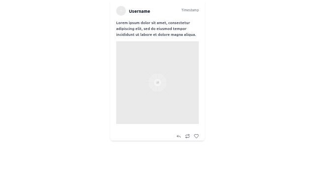
use icon instead of reply, retweet and like
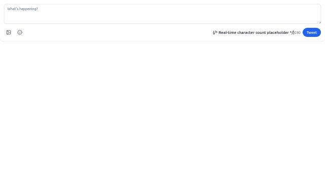
Creating an engaging and user-friendly interface for a tweet composer requires careful consideration of various design elements to ensure it is both aesthetically pleasing and functional. The theme should be clean and modern, featuring a minimalist design to keep the focus on the content being composed. A monochromatic color palette with shades of blue and white could be chosen to reflect the brand identity commonly associated with social media platforms, promoting a sense of familiarity and trust. For the font, a sans-serif typeface like Open Sans or Roboto is recommended for its readability on various screen sizes. These fonts are designed to be legible at small sizes and are widely used in digital interfaces. The main text area for composing the tweet should be set in 14pt to ensure legibility while also allowing enough space for users to write comfortably. Secondary text elements, such as character count and buttons, can be set in a smaller size, around 12pt, to maintain a clean interface without overcrowding the screen. Color usage is vital for highlighting and guiding the user. The primary action button for posting the tweet should be a bold blue, contrasting against the white background to draw attention. This button should be positioned at the bottom of the interface, within easy reach for thumb operation on mobile devices. The character count can be displayed in a lighter shade of grey, updating in real time as the user types, to provide feedback without being intrusive. The 'Compose' area should be subtly outlined in a light grey, creating a clear separation from the rest of the interface without being too distracting. Overall, the placement of elements should follow a logical flow, with the text input area at the top, followed by additional options like image or emoji insertion, and the action button at the bottom, guiding users intuitively through the process of creating and sharing their tweets.
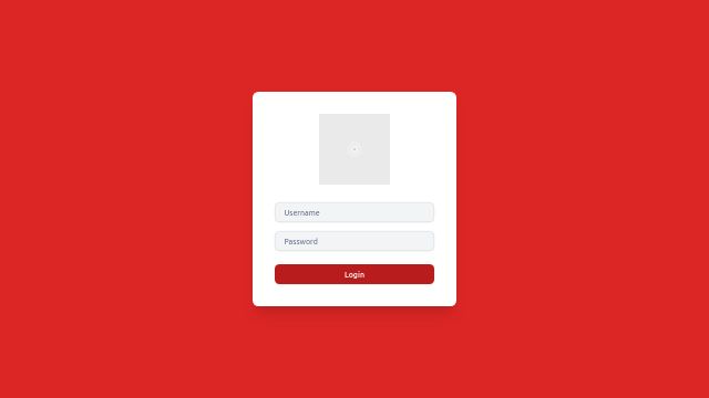
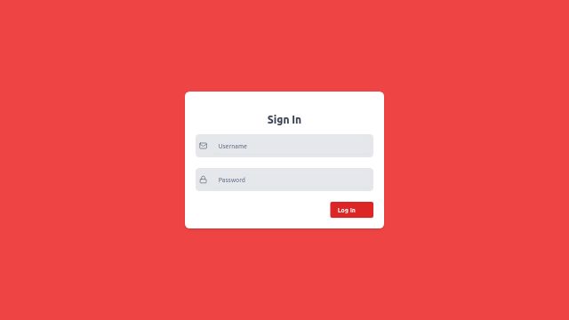
Creating a login page with a vibrant red theme involves careful consideration of color palettes, typography, and layout to ensure a visually appealing and functional design. For the color scheme, start with a primary red, such as RGB(220, 20, 60), which is a bold and intense shade. This color can be used for the background and key elements like buttons or input fields to draw attention. Accent colors should complement the red without overwhelming the design; consider shades of gray for text and borders, and a softer red, perhaps RGB(244, 63, 47), for hover states or active elements. For the typography, select a clean and readable sans-serif font, such as Google's Roboto or Arial, which are both professional and widely legible. Set the body text size to 16px for optimal readability, and use bold variants for headings and labels to create contrast. The input fields and buttons should be clearly distinguishable from the background; a light border around these elements will help them stand out. Positioning elements in a centered layout will create a balanced and focused design. Place the logo at the top center, followed by the input fields for username and password below, and a login button at the bottom of the form. This vertical alignment ensures that users can easily navigate the page with their eyes before interacting with any elements. For finer details, apply some padding and margin to create white space around the elements, which improves the page's overall aesthetic and readability. Use padding inside the input fields and buttons to make them more comfortable to click, and margins outside these elements to keep the design clean and uncluttered. When it comes to the login button, ensure it is slightly larger than the input fields, and consider adding a hover effect that changes the shade of red to provide visual feedback to the user. For the input fields, add placeholders in a lighter shade of red (RGB(200, 50, 30)) for a subtle yet impactful style. Remember, consistency in design elements such as the width of borders, height of lines, and spacing between elements is key to creating a polished and professional look. By adhering to these design principles, your red-themed login page will not only be visually striking but also user-friendly and engaging.
alert of success and error only show when click on login in page. where user name == 'root' and password == 'root' then it should be success other error on click on login. write entire logic in react login only