Arnarsson

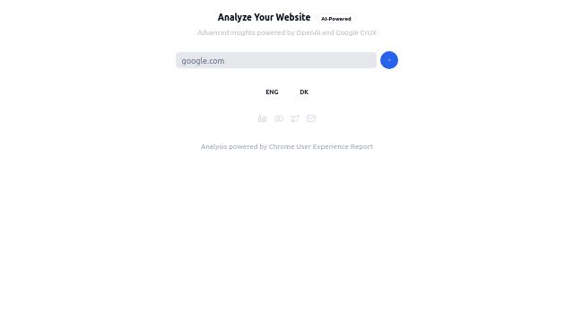
a minimalistic, dark-themed website interface with a prompt inviting users to “Analyze Your Website.” It mentions that this analysis is “AI-Powered” and provides “Advanced insights powered by OpenAI and Google CrUX.” Below the title, there’s a search bar with the example entry “google.com” filled in, suggesting where users can type a website URL to begin the analysis. There is a blue arrow button to the right of the search bar, which likely initiates the analysis. At the bottom, there are language selection buttons with “DK” for Danish and “ENG” for English, with “ENG” currently selected. There are also social media icons underneath, representing LinkedIn, YouTube, Twitter, and an email option, for easy navigation to the platform's social profiles. The interface appears sleek and professional, with a strong emphasis on simplicity and usability.

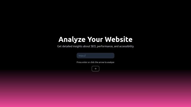
The page has a dark background with a gradient effect at the bottom, blending from pink to blue, creating a visually engaging and modern look. The color gradient adds depth without distracting from the main functionality of the page, which is clearly focused on website analysis.

use this library to make it better https://www.cult-ui.com/docs/components/expandable

https://v0.dev/chat/AB8mpKhvIZS?b=b_cQtX6ykpF2I lets keep working on this one